
Ghid 11Design Rules
The 60-30-10 color rule
Most rooms that look “like they’re from a magazine” follow the same ratio, consciously or not: one dominant color, one that supports it, and a small but noticeable accent.
Composition
A blue accent in a warm bathroom
Walls and floor in beige (60%), wood and warm gray (30%), blue at the bathtub and sink (10%). The accent is repeated twice, so it looks intentional.
 Sky Blue Resin Sink
€580,95
 Sky Blue Freestanding Bathtub
€2.594,95
60 · 30 · 10dominant, secondary, accent
 YKL Round LED Mirror
€460,95
 Strelitzia Nicolai 250 cm
€278,95
În compoziție
- Sky Blue Resin Sink €580,95
- Sky Blue Freestanding Bathtub €2.594,95
- YKL Round LED Mirror €460,95
- Strelitzia Nicolai 250 cm €278,95
-
60%
Dominant color
Walls, floors, large panels. Usually a neutral shade.
-
30%
Secondary color
Furniture, large textiles, doors. Supports dominance.
-
10%
The accent
Lights, accessories, plants, art. The color that catches the eye.
Sketch
Proportion, on a strip
Think of the room as a total surface area divided into three. The walls and floor are the largest surface, so they get the dominant color. The furniture gets the secondary color. The accent remains for the small objects.
How the rule works
The rule divides the colors of a room into three groups, based on the surface area they occupy:
- 60% dominant color: walls, floor, ceiling, large panels. Usually a neutral shade: warm white, beige, gray, greige.
- 30% secondary color: large furniture, sofa, curtains, doors, bathroom furniture.
- 10% accent: pillows, lighting, accessories, plants, paintings, a colorful bathtub.
Room examples
| Room | 60% | 30% | 10% |
|---|---|---|---|
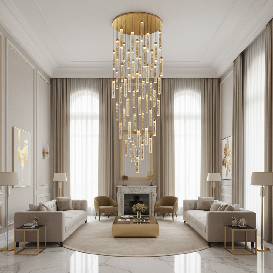
| Warm living room | beige and warm white | walnut wood, gray sofa | gold chandelier and wall lights |
| Calm bedroom | greige | light wood, textiles in | sage green, plants |
| Contemporary bathroom | light gray tiles | anthracite furniture | black faucets, wood |
| Warm bathroom | beige marble | wood and stone | brushed gold |
How to choose the accent
The accent is the color that gives the room its personality. Because it only occupies 10%, it can be bold: an intense blue, a dark green, a burgundy red, gold. To make it look intentional, repeat it at least two or three times in the room: the chandelier and the picture frame, the bathtub and the sink, the pillows and the vase.
Metals and lighting count as an accent
The metal finish of the light fixtures, faucets, and handles is part of the 10%. A gold chandelier in a neutral living room is already the room's accent; it doesn't need three more strong colors around it.
Designer's tip: before you buy, place samples of the three colors on the table, in their real proportions: one large, one medium, and one small. You will immediately see if they match.
Common mistakes
- Three strong colors in equal proportions, competing with each other.
- The accent used only once, which looks like a mistake.
- A completely neutral room, without any accent, which looks unfinished.
From the store
Products suitable for this guide
Stoc epuizat

Stoc epuizat

Stoc epuizat

Stoc epuizat

BK006/1000X700 LED Mirror
€629,95
Stoc epuizat

Stoc epuizat

Checklist
Before you order
Five quick checks to ensure the product you choose is right the first time.
- We chose the dominant color for the walls and flooring.
- The large furniture has the secondary color.
- The accent takes up about 10% and appears at least twice.
- The metallic finish is part of the accent, not competing with it.
- We checked the colors on the samples under room lighting.



Free consultationWould you like an opinion on
Would you like an opinion on
your room?
Send us the room dimensions and, if you have one, a photo to contact@aqualumen.ro. We will recommend products with the right size and style.